For some, choosing a color palette is a frightening endeavor—but it shouldn’t be! Color is meant to enhance the architecture and design of your home, and it can do wonders to improve your home’s aesthetics, when used correctly.
Below are a few tips that we’re sure will help you in your color scheming.
- Look into your closet.
The colors you wear are a good indication of the colors you like—and, you already know you look good in them. Don’t paint a room orange if it that color doesn’t complement your skin tone, you’ll wind up looking tired and washed out in it. Instead, use your closet as a starting point for color selection.
- Draw from the largest pattern in the room.
If you have upholstered furniture or a large, patterned area rug that you really love, pull colors from the patterned pieces in your possession to create your color palette.

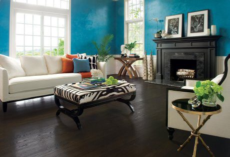
- Decorate from dark to light, starting with the floor.
This is perhaps the easiest “rule” to follow. Use color in your home like it appears in nature—with the ground being the darkest, the walls containing a variety of medium hues, and the ceiling being the lightest surface in your home. Since most ceilings are white, it’s likely that you already have the last part taken care of.
- Get help!
There are several online resources available to you, like the design seeds palette search. On their website, pick a color to start with, and search the website for palettes containing that color. Or, simply browse their palettes according to theme.
And, remember that you can always get help from Carpetland USA. Our experts can help you find a floor to match any color scheme, or a color scheme to match your favorite Carpetland USA floor.